This is Finto
We’re a breath of fresh air to the stuffy, corporate world of finance. We’re here to shake the industry up with a punchy, expressive attitude that makes people sit up and listen.
Here you’ll find all of our core brand assets and guidelines. Use them for all your Finto projects to create consistent and engaging content for our users.
Our mission
Power
innovation
For too long, creating innovative financial products has felt like an insurmountable challenge, but we’re on a mission to put that right. We’re building a platform that will connect consumers, developers, entrepreneurs and financial institutions.
Logos
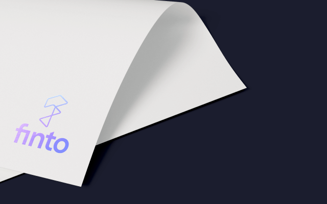
Our logo consists of two parts: the logo mark and the word mark. They can be used independently or together in a lock-up, depending on the placement and application.
Logo mark
Our new logomark for Finto is a simple, modern and iconic symbol for unparalleled creativity. The single unbroken line represents the flowing nature of data and of the infinite creative possibilities inherent in it.
The mark is created using impossible geometry (reminiscent of the work of M.C.Escher) that is inescapably mathematical and challenges the very nature of what we perceive to be possible. Creating a seamless and dynamic interplay between mathematics and creativity.
Download logo
Clear space
Wordmark
Our wordmark is bold yet simple. It is our name, so it helps to qualify the abstract nature of our symbol. The wordmark’s characters reflect the shape of our symbol and create a balance between the two elements.
When it comes to our wordmark, always use the master artwork. Our wordmark is our name ‘Finto’, it represents us as a company, therefore it’s paramount that we treat it with utmost respect.
Download logo
Clear space
Lock-up's
Our symbol and wordmark often work independently, but there are occasions when they need to work together. We use two versions of our combined logomark and wordmark — a horizontal version and a vertical version.
The best version to use depends entirely on the application and the space you have to place the logo.
Download logos
Clear space
Color
Our color palette is predominantly monochromatic, with flashes of bright colour to add flashes of delight to our brand communication.
Primary palette
Our primary palette consists of three monochromatic colours. These are our most used colours, ensuring our communications are simple and smart (just like our tech).
#1F2133
#EEEDEE
#FFFFFF
Secondary palette
Our secondary colour palette consists of five bright accent colours. These are used sparingly to create moments of delight throughout our communication.
#E6469B
#FF9C2E
#23B482
#4B69FF
#FF503C
Color gradients
We have developed the Finto colour palette so that any of the colours can be used in combination to create enlivening colour gradients.
Tints & shades
#AF2068
#C83773
#E9759A
#EFA2BB
#F7D1DD
#FBECF1
#DD7105
#ED8514
#FFB554
#FFCD8C
#FFE6C6
#FFF5E8
#11895B
#1D9E70
#5BC5A2
#91D8C1
#C8EBE0
#E9F7F2
#284CBF
#3555DB
#7A8DFF
#A6B3FF
#D2D9FF
#EDEFFF
#C62B24
#E23A2D
#FD7B6E
#FDA79D
#FED3CE
#FEEDEB
#353747
#4C4D5C
#A5A6AD
#D2D3D6
#E8E8EA
#F4F4F5
Typography
Finto uses a typeface pairing of Whyte and Space Grotesk for our brand communications. Space grotesk is our primary typeface to be used in most situations, Whyte is used primarily for big punchy headlines and deployed when we need to grab peoples attention.
Whyte Inktrap
Aa Bb Cc Dd Ee Ff Gg Hh Ii Jj Kk Ll Mm Nn Oo Pp Qq Rr Ss Tt Uu Vv Ww Yy Xx Zz Aa Bb Cc Dd Ee Ff
Whyte Inktrap is a modern sans-serif that features deep inktraps in the joints of its letters, giving it a machine tooled, industrial aesthetic that makes its perfect for punchy headlines that stand out from the crowd.
Whyte
Aa Bb Cc Dd Ee Ff Gg Hh Ii Jj Kk Ll Mm Nn Oo Pp Qq Rr Ss Tt Uu Vv Ww Yy Xx Zz Aa Bb Cc Dd Ee Ff
Whyte is an alternate cut of Whyte Inktrap, as the name suggests, it is identical but has the inktraps removed. It's perfect for when Finto needs to communicate in a slightly subtler more refined manner.
Space Grotesk
Aa Bb Cc Dd Ee Ff Gg Hh Ii Jj Kk Ll Mm Nn Oo Pp Qq Rr Ss Tt Uu Vv Ww Yy Xx Zz Aa Bb Cc Dd Ee Ff
Our primary brand typeface is Space Grotesk. It's modern geometric grotesk based on space mono. It is also a variable typeface making it incredibly versatile, allowing an unprecedented level of control and flexibility reflecting Finto's own products and service.
Build it
Applications
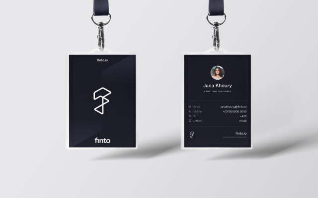
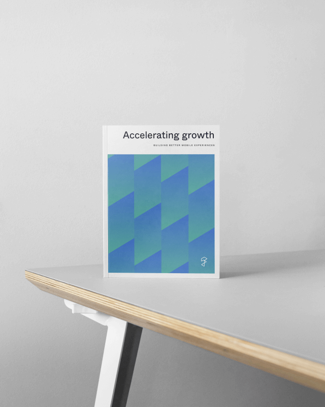
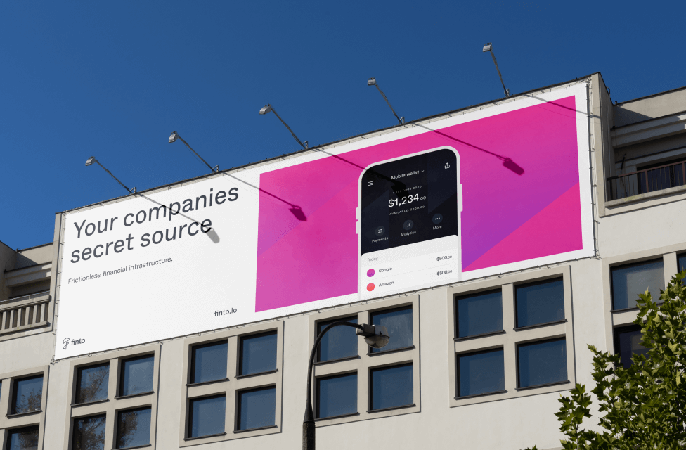
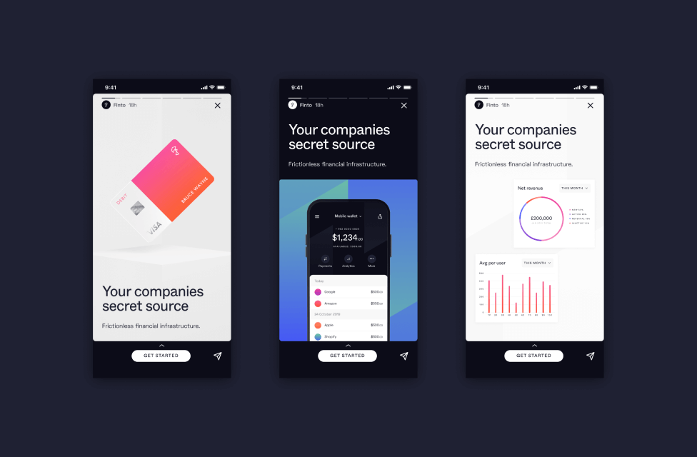
We have put together a small selection of applications showing how all the brand elements combine to bring Finto's visual aesthetic to life.
Brand assets
Download all the Finto brand assets as a single ZIP file now (or download them individually below). The download includes all logos, colours, typefaces, guidelines and templates.